When designing printed publications it is common to use endnotes or footnotes. However when considering the absence of pagination and height limit in the scrolly nature of web pages, scrolling back and forth to read notes listed at the end of an essay, and then back to where we were at whilst reading, kind of sucks.
Here comes sidenotes.
Example of a sidenote in Tufte CSS by Dave Liepmann – website
Pseudocode
The following demo works when working with static HTML content. If working with Markdown, content needs to be parsed, and a JS script is needed.
Structure
We need two structural elements:
Sidenote mark (within text container)
For this we can use a <label> for the note mark, along with a checkbox <input type="checkbox"> (useful for mobile, see below)
Sidenote content (aside from text container)
Note content can sit within a <span>, directly after the <label> and <input>.
Style
We will need to define the following:
max-width of the text elements within the <article> container
width of the sidenotes
margin space between text container and sidenotes
max-width of the overall <article> container
a CSS counter to number marks automatically
Features
Smaller VS Wide screens behavior:
Click to pop in note on mobile (input checkbox)
Visible by default on wider screens
Automatic note mark numbering (using CSS Counter)
<article> <p> This is a paragraph about sidenotes. This is a paragraph about sidenotes. This is a paragraph about sidenotes.<label class="sn-mark" for="sn-exemple"></label><input class="sn-toggle" type="checkbox" id="sn-exemple"><span class="sn-content">This is the sidenote content.</span> Paragraph text continues here. </p></article>
The float + negative-margin trick above has two weaknesses: the float/gutter math is fragile (the calc() bug from earlier lived exactly there), and notes stack in float order rather than lining up with the mark that produced them. CSS anchor positioning fixes both — each .sn-content is pinned directly to its own .sn-mark via anchor(), so notes align to their mark’s line instead of stacking top-down. The text column still has to be capped narrower than the article (article > p { max-width: var(--content-width) }) so running text doesn’t flow underneath the notes — anchoring removes the float/margin arithmetic, not the need for a text column.
The catch: anchor-name has to be unique per mark/note pair, and CSS alone can’t generate that for an arbitrary number of notes — a build step (the same one already needed to turn Markdown into marks/notes) would stamp a unique name on each pair. Below, the two pairs get theirs by hand to keep the demo static. Support is recent (Chromium first, Safari and Firefox following in 2025), so this is wrapped in @supports — browsers without it just render the note inline, right after its mark, which is a reasonable fallback on its own.
One thing anchoring does not give you for free: collision avoidance between notes. Floats naturally push an overlapping note down to the next free slot in the column; two anchored notes with no vertical room between their marks will simply overlap. The two marks below are spaced out enough to avoid it, but real content — marks close together on adjacent lines — would need the same kind of JS nudging that Gwern’s sidenotes.js already does for the float approach.
<article> <p> This is a paragraph about sidenotes.<label class="sn-mark" for="sn-1" style="anchor-name:--sn-mark-1"></label><input class="sn-toggle" type="checkbox" id="sn-1"><span class="sn-content" style="position-anchor:--sn-mark-1">Aligned to this line, wherever the mark sits in it.</span> This is a paragraph about sidenotes. This is a paragraph about sidenotes. This is a paragraph about sidenotes. This is a paragraph about sidenotes. </p> <p> A second, later paragraph with its own mark<label class="sn-mark" for="sn-2" style="anchor-name:--sn-mark-2"></label><input class="sn-toggle" type="checkbox" id="sn-2"><span class="sn-content" style="position-anchor:--sn-mark-2">Independently aligned to its own line — not stacked after the first note.</span> shows each note tracking its own mark rather than the previous note's position. </p></article>
*, *::before, *::after { box-sizing: border-box;}:root { /* CSS counter */ counter-reset: sn-counter; /* Variables for max-/widths */ --content-width: 650px; --sn-width: 250px; --sn-margin: 32px;}/* Mask checkbox input */.sn-toggle { display: none; }/* -------------------------------------------- *//* Using counter */.sn-mark { counter-increment: sn-counter; cursor: pointer;}/* Mark: Insert counter value */.sn-mark::after { content: counter(sn-counter, decimal); vertical-align: super; font-size: 0.75em;}/* Content: Insert counter value */.sn-content::before { content: counter(sn-counter, decimal) ". ";}/* -------------------------------------------- *//* Layout – Desktop */article { max-width: calc(var(--content-width) + var(--sn-margin) + var(--sn-width)); position: relative;}/* The text column itself still needs to stay narrower than the notes' column — that doesn't come for free just because the notes are anchored. Unlike the float version there's no shared padding-right gutter to compute; the paragraph is simply capped to --content-width. */article > p { max-width: var(--content-width);}@supports (anchor-name: --sn-mark-1) { .sn-content { position: absolute; width: var(--sn-width); margin: 0; /* Vertical position tracks the mark's line — that's the part anchoring buys us. Horizontal position is a fixed column, same idea as the float version's gutter: it must NOT track the mark's own x, or a note anchored to a mark near the right edge of a line would land on top of the following line's text. */ top: anchor(top); left: calc(var(--content-width) + var(--sn-margin)); }}/* -------------------------------------------- *//* Layout – Mobile: same click-to-reveal pattern as the float version, just toggling `position` back into flow instead of `float`. */@media only screen and (max-width:1024px){ .sn-content { position: static !important; display: none; width: 100%; margin: 1em 0; } .sn-toggle:checked + .sn-content { display: block; } .sn-mark { color: blue; }}
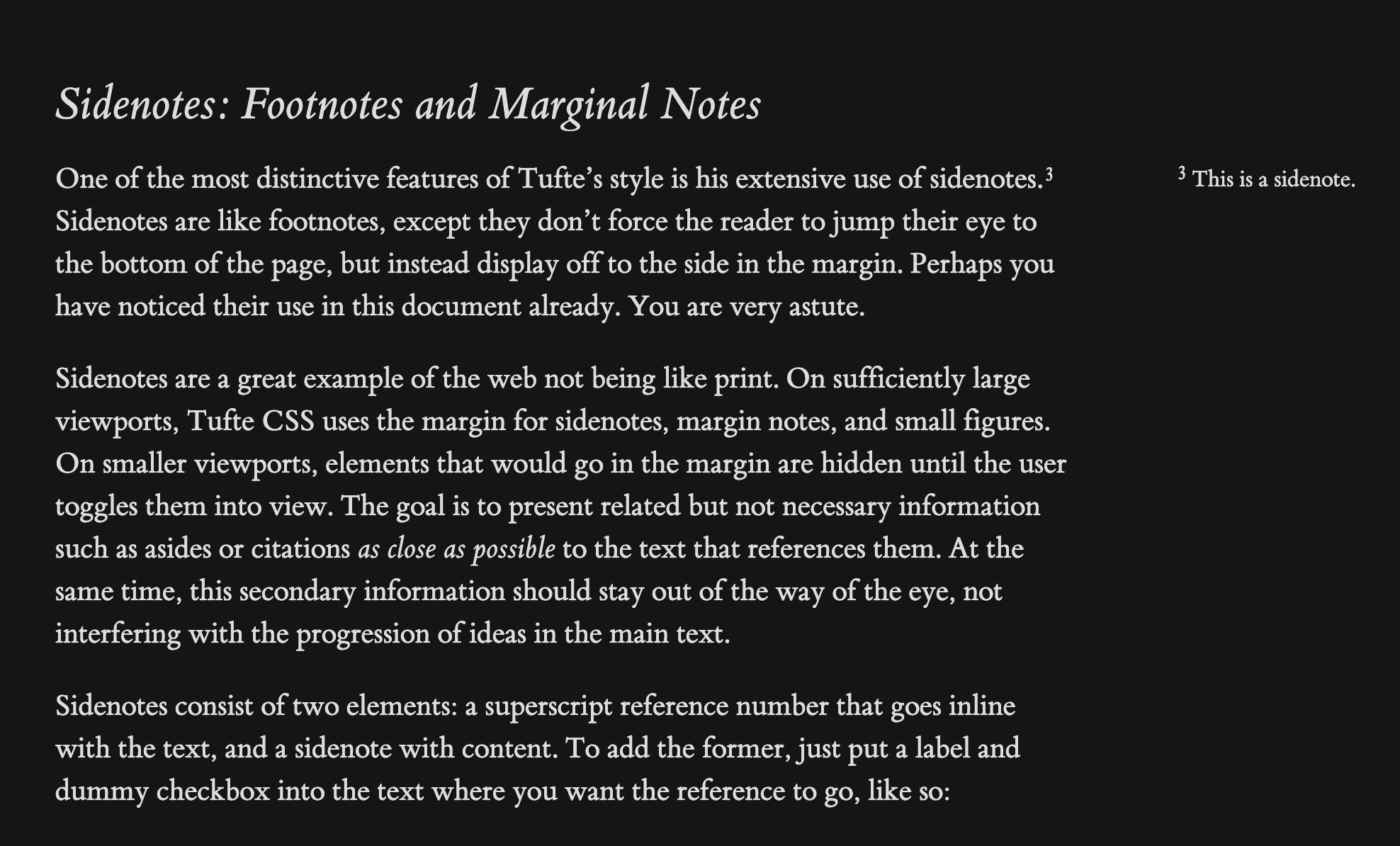 Example of a sidenote in Tufte CSS by Dave Liepmann – website